CRIMES AGAINST DESIGN – BOX PARK PHOTOS
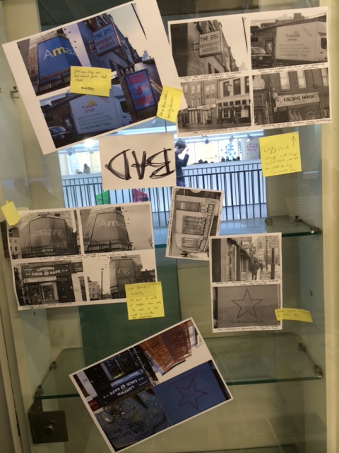
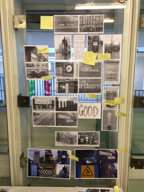
During this lesson we arranged the photographs taken at box park into groups which represent good and bad design. We then looked around the classroom at other groups photographs and wrote comments on sticky notes which could help the group develop on their projects initial idea.
THE GRID SYSTEM
Today in the studio we looked at the grid system. The grid system will give your design a professional look as it helps give it:
- structure and order
- greater accuracy
- placement
- organisation
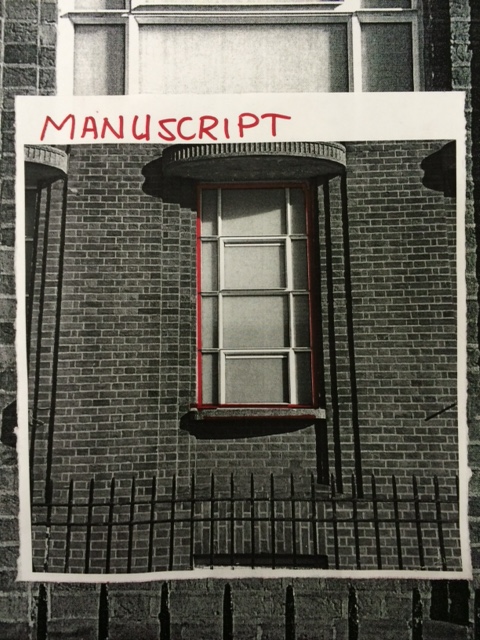
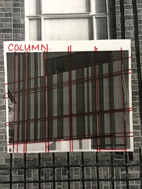
For out task we were asked to work in groups of 3 and to photograph grid systems that we could see on buildings and architecture around the area.
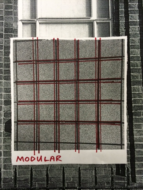
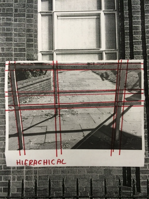
You can probably see that there is different titles on each image. These titles are different grid systems.
The four different grids are as following:
- Manuscript – One column with two boxes above and below.
- Column – Simple columns across the page which allows for a more dynamic design.
- Modular – This grid allows for both horizontal and vertical layouts.
- Hierarchical – Free form.
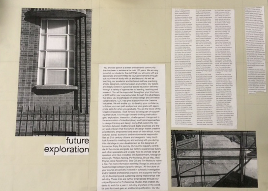
One we did this smaller designs we then used words and imagery together using a chosen grid system, we chose Hierarchical.
So here is our outcome which is a basic layout using the Grid System.
PECHA KUCHA
This friday I have been asked to do a mini Pecha Kucha. The purpose of this is to receive feedback from not just tutors but my peers, on how i could improve and the pros and cons of my idea.
Defintion:
So instead of talking about 20 images for 20 seconds i will be talking about 10 images for 2 minutes. Below are my slides, with a question I will be asking the audience at the end.
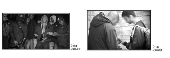
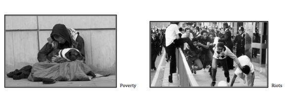
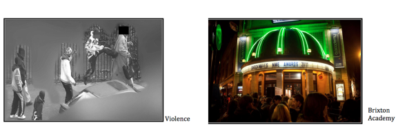
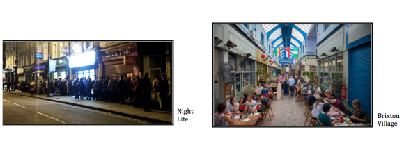
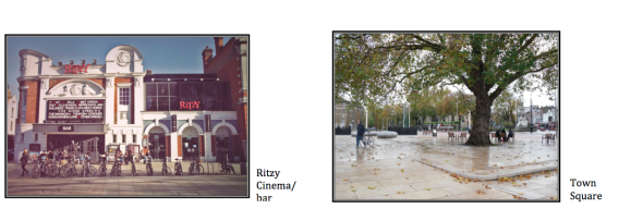
At first I will be talking about how Brixton used to be and what people thought and some still think of Brixton. I will then move on to how Brixton has changed and is now an up and coming area in London and what will actually be in my Zine.
MINI SKETCHBOOK – KOREAN FOOD
In this task we were asked to go off in to small groups of four (or five) for a couple of hours and experiment with different mediums and styles in which we could present a sketchbook.
Each group was given a theme, my group asked for Italian food so to make the task slightly more complicated we were asked to look at Korean food. Turns out we got lucky as one member of the group knew about some Korean food shops around the area.
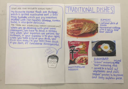
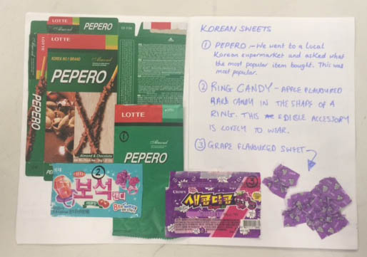
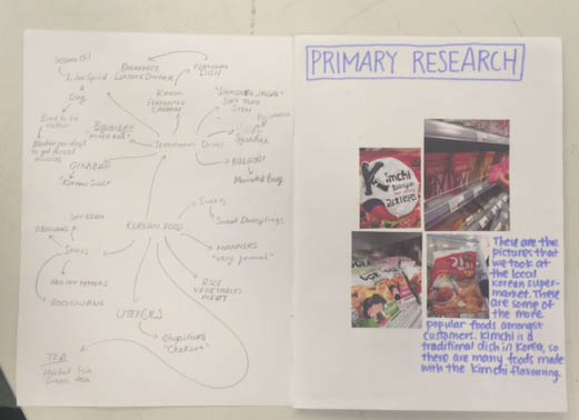
So, for ‘primary’ in our mini sketchbook we adventured off to these food shops and had a look at what sort of food people eat in Korea. We took some photographs of the food packages and some members bought some packages to put in our sketchbook to make it more interesting. We also interviews some of the staff in the shop and asked them what they think are some of the most popular products in the shop.
After our small adventure we went back into the library and started laying out our research on pages with some evaluation.
After a while we found out that another member in our group knew someone Korean so we decided to interview them as well. We asked about what sort of food they enjoy the most and what some of the strangest Korean food was.
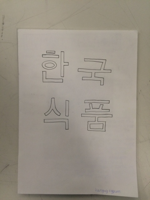
Here are the pages from our ‘Mini Sketchbook’…
TYPOGRAPHY LAYOUTS – GESTALT THEORY
Today in our lesson we looked at the Gestalt Theory. Definition: Gestalt is a psychology term which means “unified whole”. It refers to theories of visual perception developed by German psychologists in the 1920s. These theories attempt to describe how people tend to organize visual elements into groups or unified wholes when certain principles are applied.
Our Task
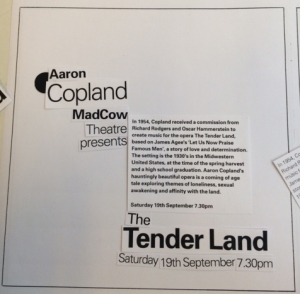
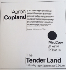
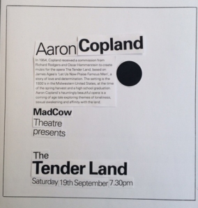
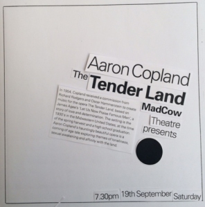
After we discussed this theory we then went ahead and started using typography and come up with some layouts which allow the readers eye to easily follow through the poster or design without being messy and confusing.
Here are most of the outcomes:
i actually quite like the way you have made a mini sketchbook within a blog and photographed your work that you have created by hand in another sketchbook. this kind of links all your body of work together. plus love the many designs picture on your blog cover nice typography there.
LikeLike